Hello. In this post I will talk about presenting your game, in this case for the Alpha milestone, in a way that connects with your game in terms of visuals and mechanics. If you would like to learn more about this project you can check my previous blog posts “An Easier Sprint Overview” where I talk about changes to a template that we received from our teacher when first introduced to a project methodology called Scrum and “Designing a Main Menu That Fits Your Game” where I talk about creating a menu that connects with your game in terms of it’s visuals and mechanics.
When making the presentation for our Alpha milestone which had certain requirements that were given to us by the teacher such as what concept where we working on and why did we choose it, how did we interpret it, positives and negatives about the project, examples on how we could have prevented the negatives, our focus for Beta and of course, introducing ourselves.
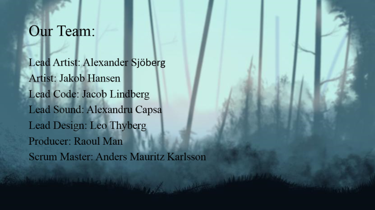
I will start with just that (introducing ourselves) by taking this opportunity to introduce my team:
The presentation was done with Microsoft PowerPoint and amounted to a total of 9 slides. After that we moved on to showing our game in motion on the projector screen.
What I meant by tying in the presentation with the game’s mechanics was (due to readability issues) only used on the very first slide:
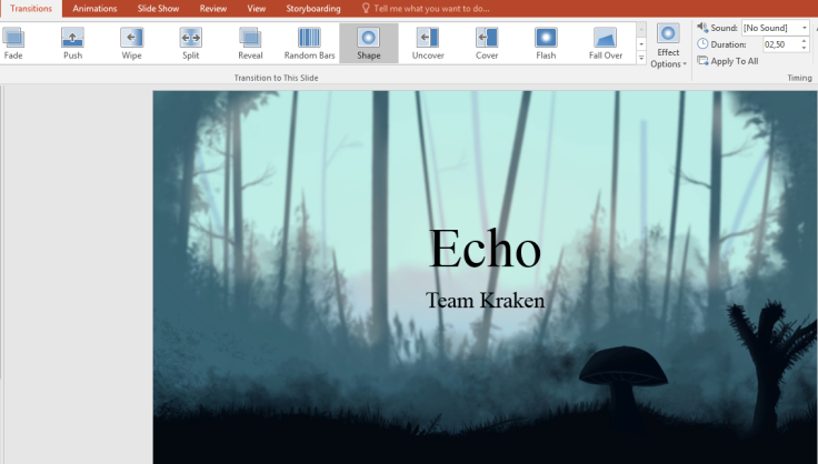
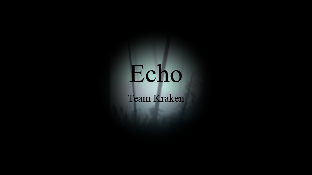
By using the highlighted effect “Shape” you can see in the picture I was able to some extent mimic our main mechanic of the game, where you as a player have the ability to reveal the area in front, top or down from you in order to navigate through a maze like level and avoid enemies along the way. For a more detailed view on that mechanic I recommend checking out my previous blog post “Designing a Main Menu That Fits Your Game“. In order to try and mimic that I also increased the duration of the transition effect so it’s more accurate to the actual speed it has in the game. This picture also contains the very first slide I mentioned earlier, the only one to use this effect. You can see the effect in action below:
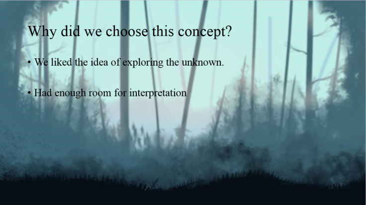
The first slide is also the only one to contain more elements in the background (made by our Lead Artist) used for the presentation. Those have been removed as you will see below in order to allow for focus on the text:
The presentation connects with the game in terms of it’s visuals and mechanics by using the actual background of the game and by mimicking the reveal mechanic.
As this blog was more about how the presentation connects with the game rather than about it’s content I will leave that out for now and end it with noting that making this presentation was enjoyable and it gave a sense of joy, having it show our game by using simple Microsoft PowerPoint visuals.
Thank you for reading and see you next time!
Next time, A light that increases in size as you progress in the game.

February 28, 2017 at 11:00 pm
Hello Raoul,
Nice job on the blog overall and I enjoyed reading it. It didn’t exactly follow the instruction as you are expected to be writing about what you have done for the week but it nonetheless contains good information. In the blog you give many good ideas about how to make a informative and enjoyable presentation. For example, I really like your idea of using actual game background for the powerpoint, which was exactly what I did for my presentation. Also I think it is very good to hint your game’s mechanics as it is much better showing it then just plainly talking about it. So yeah the power point looks really nice and I look forward to watching your next presentation.
LikeLike